

HOMER Reading Redesign
Product Design (UX/UI)
Kids app Ages 2-8
When I joined HOMER in 2018, our team got to work understanding and improving this app already in market. We conducted countless kid-tests to inform UX decisions, and all UI improvements incorporated new branding in support of better usability. I worked closely with our iOS and Android developers to implement the designs and interactivity.
Product Design Improvements
After conducting an audit on the existing product, my primary goals were to create consistency and focus within the child experience. Each screen in the app was tested with children to identify major pain points and inform the design direction. I simplified most screens to give us some runway with future features and iteration. However, quickly after these screens were completed our portfolio strategy shifted and another rebrand occurred (See HOMER Learn & Grow)
Main Menu

Before: Too many distractions and buttons for kids to easily navigate. We saw a lot of frustration and confusion on this screen.
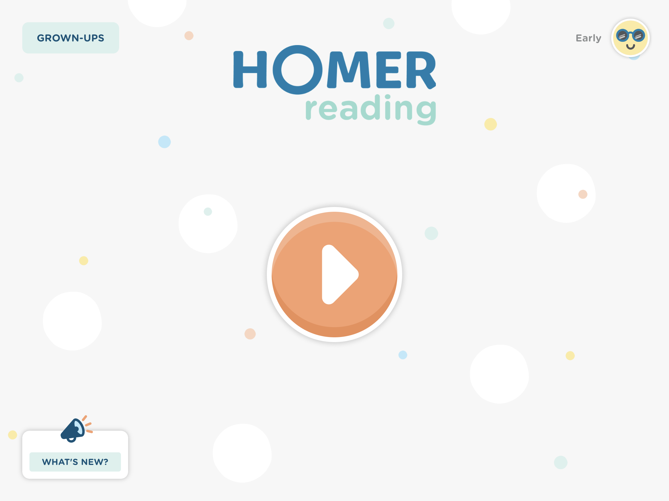
After: Kids quickly tap the play button to get started.
Reading Pathway

Before: The only interactivity on this screen is the lessons. We saw a lot of taps on the bottom icons, distraction with the background art, and confusion around “locked” lessons.

After: Kids are focused and understand where to tap.
Lesson Menu

Before: Two-way scroll was confusing for kids, and hierarchy is confusing.

After: One way scroll for all menus, easily switch between lesson types using filters at the top.
Drawboard

Before: Dated visuals and buried tools left a lot of room for improvement

After: A clean, tactile drawing environment that adjusts better across devices.

HOMER Reading: Learn to Read
Ages 2-8
KEY COLLABORATORS:
Ashley Mannetta (UXR), Abby Adams (PO)